Resero
Brand strategy, naming and design identity for an MEP engineering consultancy.
Above & Beyond
Messaging refinement and visual rebrand for a independent recruiter who work in the climate tech sector.
The brief
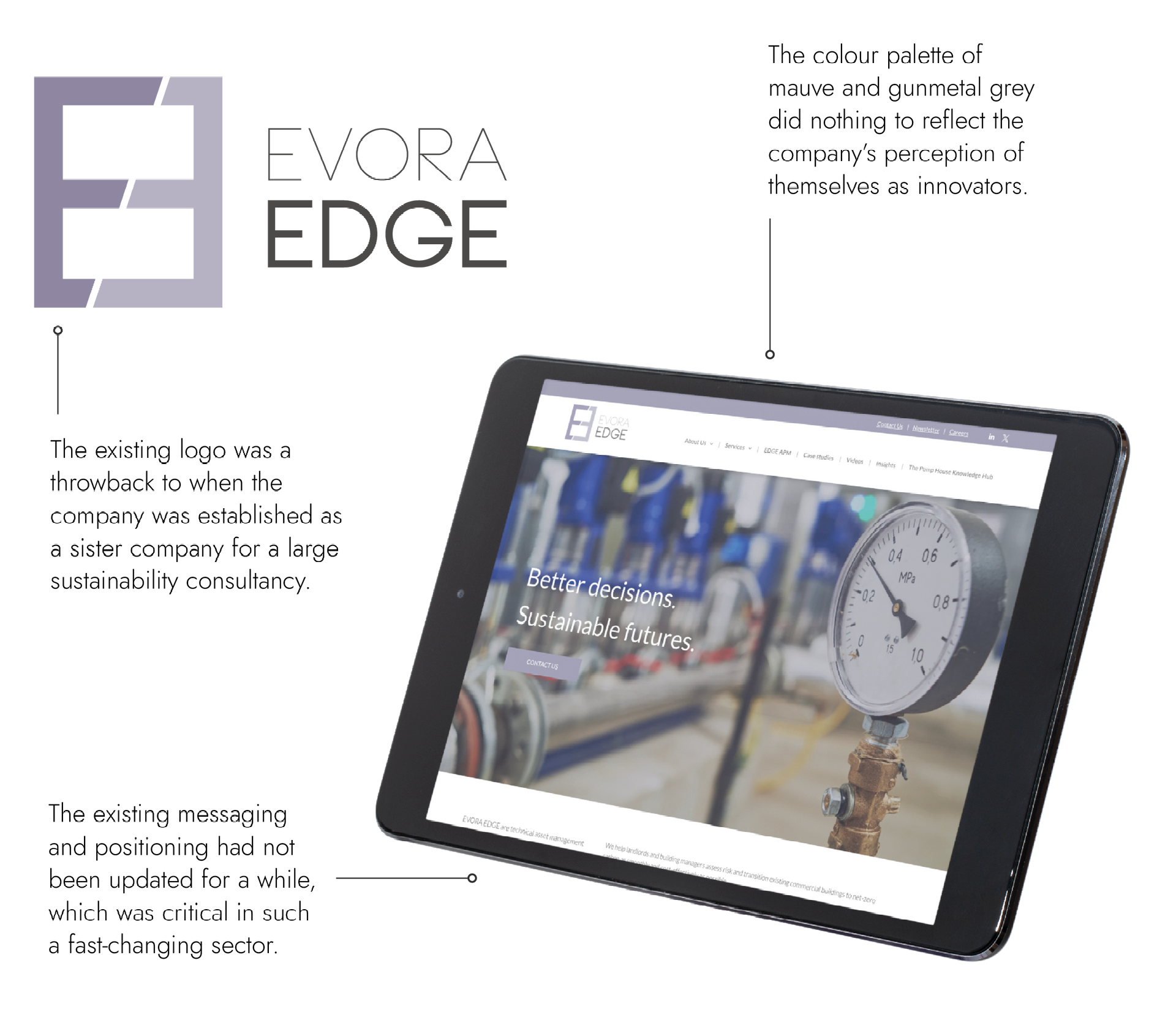
Evora Edge is an MEP engineering consultancy that ensure the long-term viability of real estate investors’ portfolios by translating sustainability strategies into engineering solutions. In early 2023, Avery & Brown were approached to undertake a full rebrand and renaming process.
Having split with their parent brand Evora Global in 2019, the team felt they needed to create a distinct identity that would appeal to a fast-changing market: from a new name to a new website, everything was on the table.
We launched the project in May 2023 with a period of auditing, research, and workshopping to build and refine their strategy and positioning. This groundwork informed the naming process and the creative execution that followed; ensuring alignment with a research-led strategy.
The original brand
The background
Above & Beyond is a recruitment consultancy who work with innovative technology start-ups in the sustainability space. They specialise in partnership-based recruitment, working as an extension of their clients to find them the senior developers and CTOs they need to boost their growth and positive impact. Having had a successful first few years, the company was looking to develop their visual brand and clarify their messaging.
The original brand
Brand story and purpose | Messaging | Design identity |
Copywriting support | Brand playbook
Brand story + purpose | Naming | Positioning | Design identity |
Copywriting | Web design | Video production | Brand activation
The brief
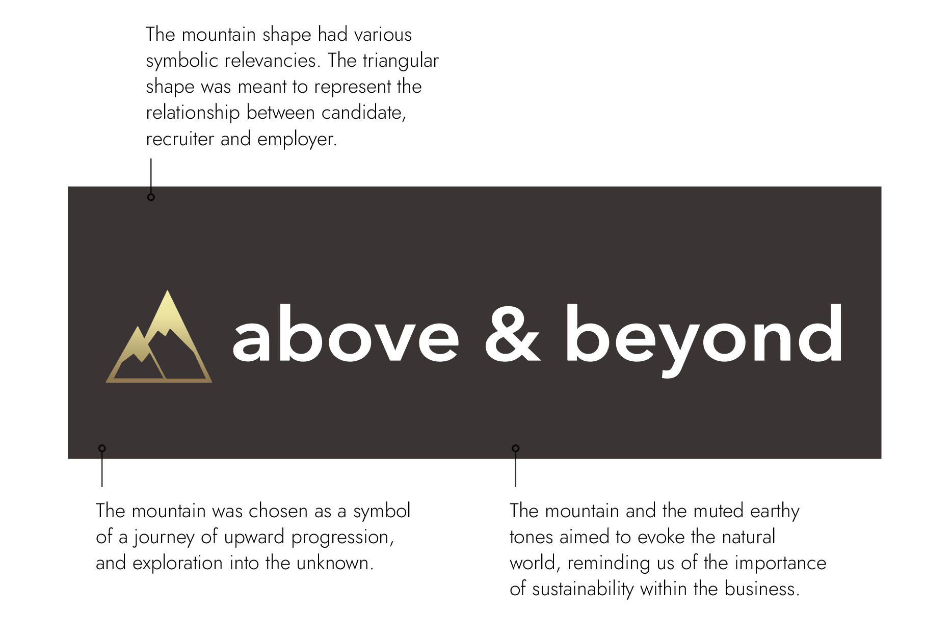
Cherry was keen to retain the original strategic meaning held in the previous design style, but to develop something that appealed to a highly innovative sector and that felt professional but not too corporate.
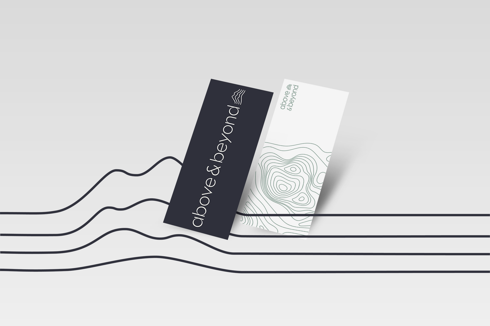
The chosen route did just that, inspired by visual resources like cartography and geological illustration, it shifts the literal symbol of a mountain to a more abstract interpretation. The contour motif appears in a restrained form within the logo, and with more complex counterparts in the graphic elements used on image treatment and backgrounds.
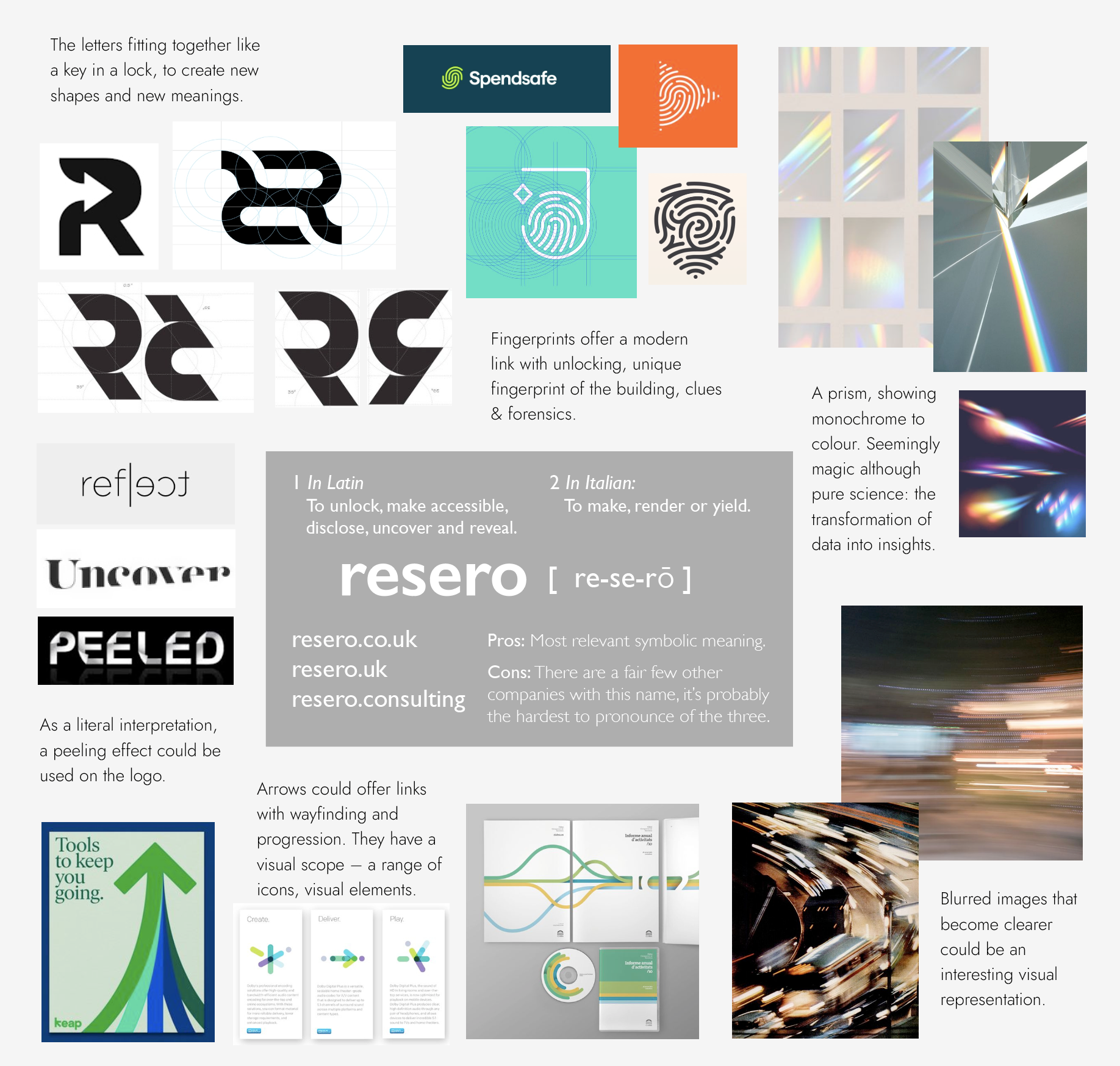
A new name
From the beginning, the team were keen to have a name that felt conceptually relevant to their offering. Starting with the nomenclature of engineering, architecture and sustainability, we compiled a list of words which were then translated into multiple languages and concatenated with other associated words.
In time, we narrowed it down to three options. These were then presented back to the team as visual moodboards that brought the respective names to life.
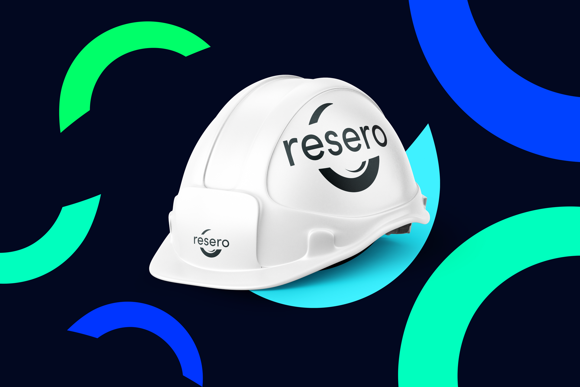
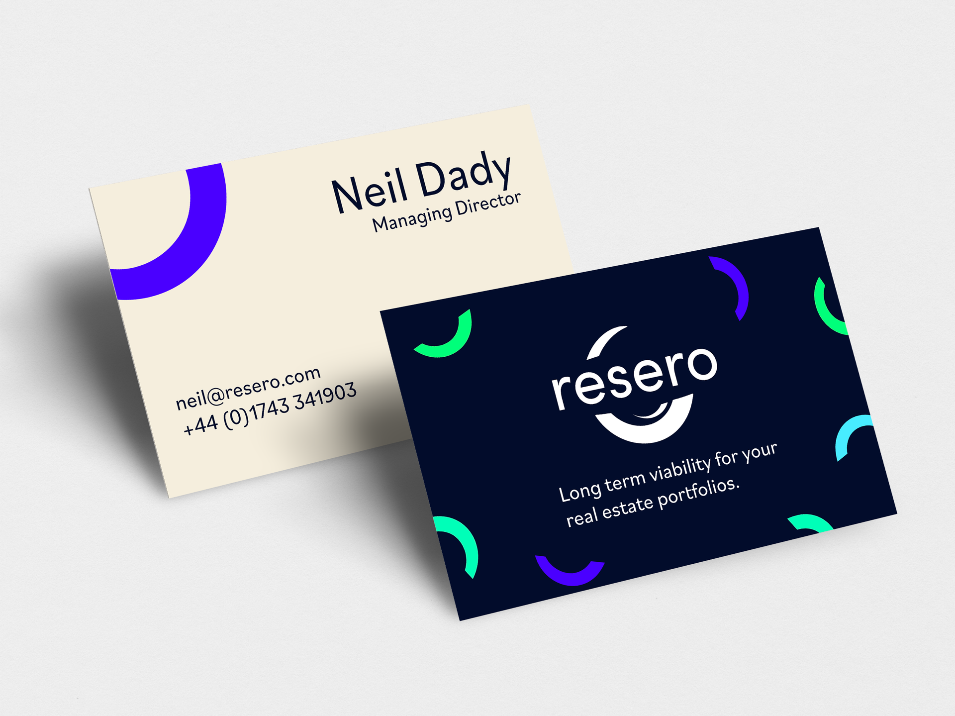
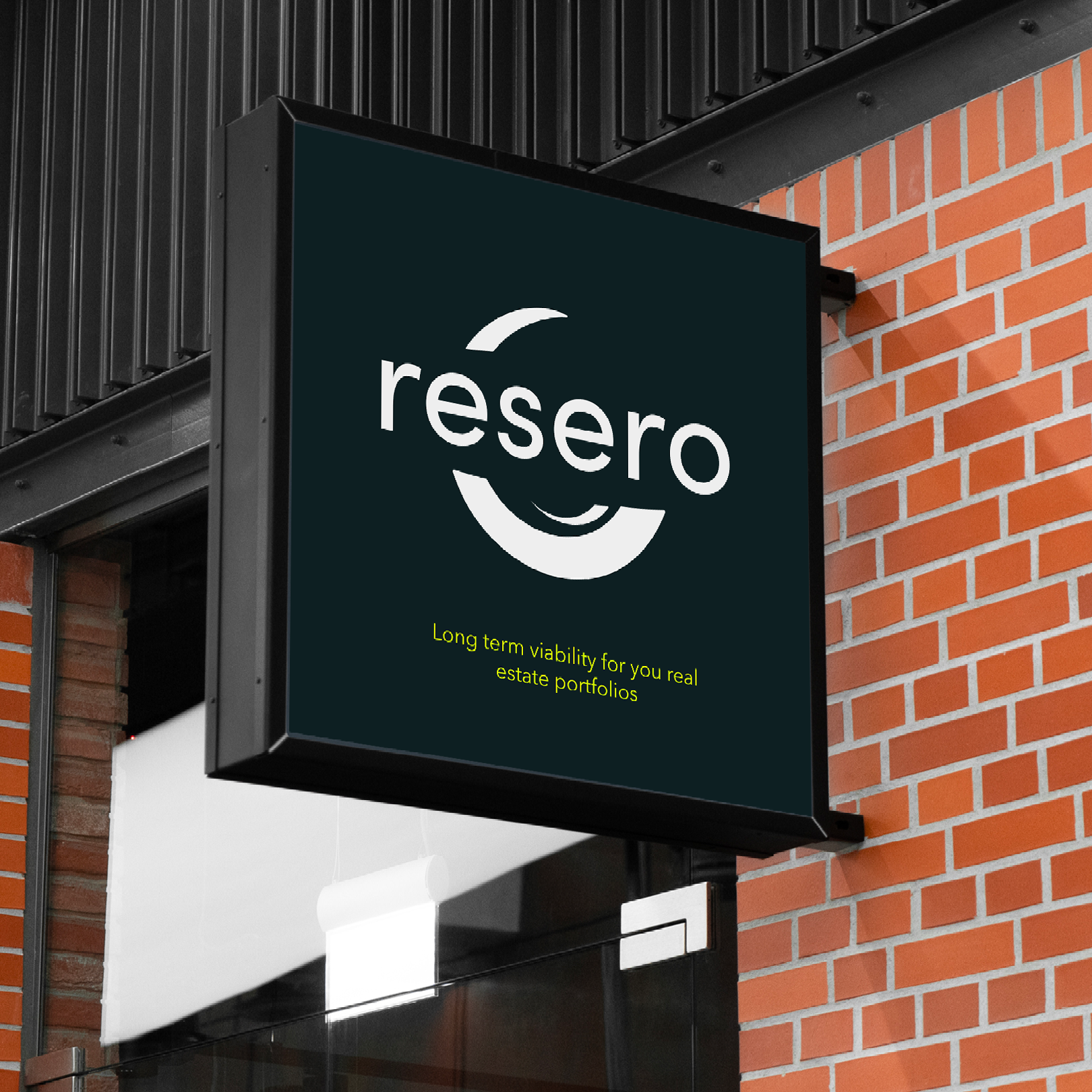
Resero was chosen for its conceptual relevance and aural appeal. The word comes from the Latin for “unlock” or “reveal”, which the team felt best reflected their role as consultants and engineers. Theirs is a role of transformation – they get underneath the plaster of the building, turning data into insights, strategy into solutions.
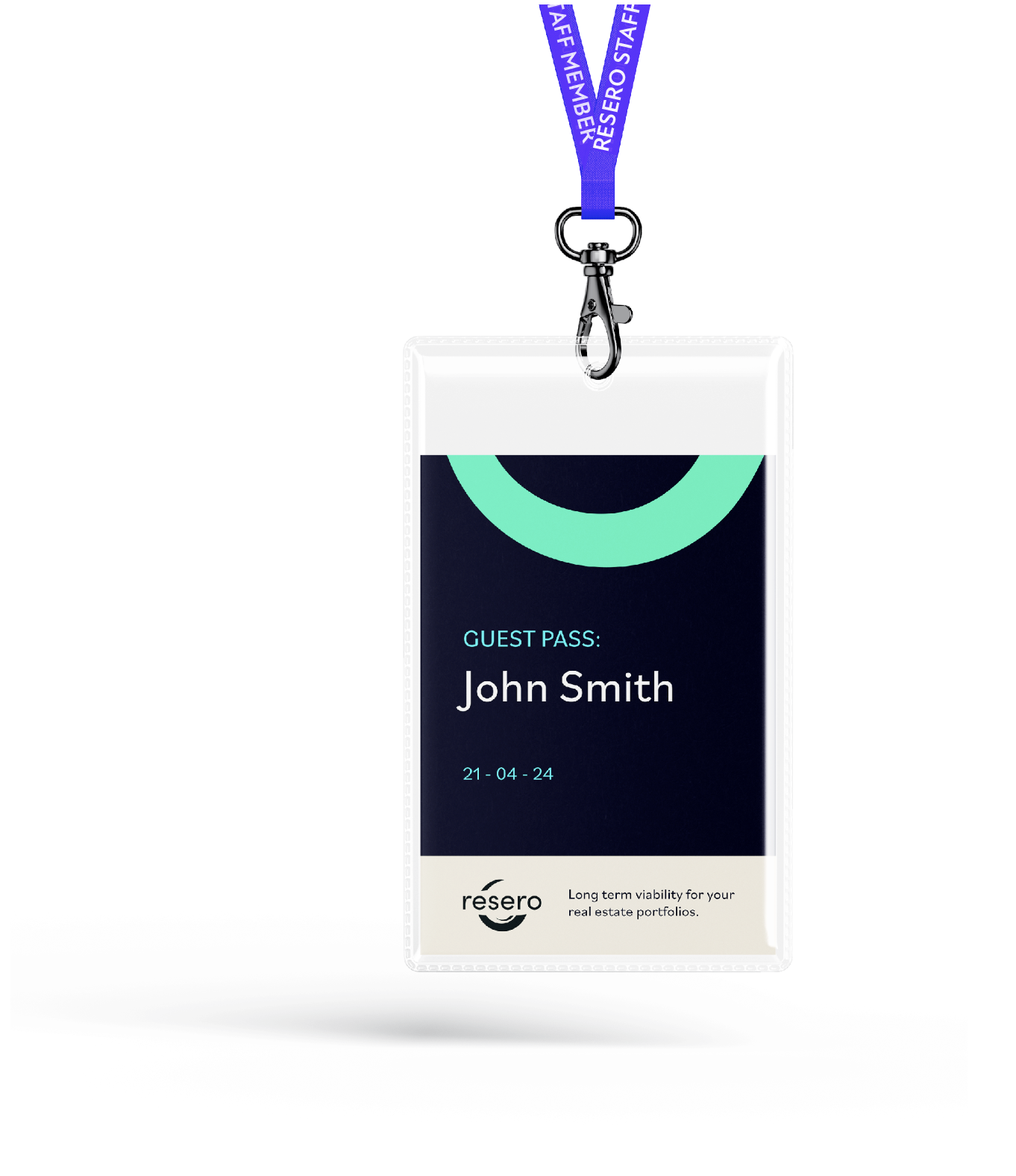
Brand identity design
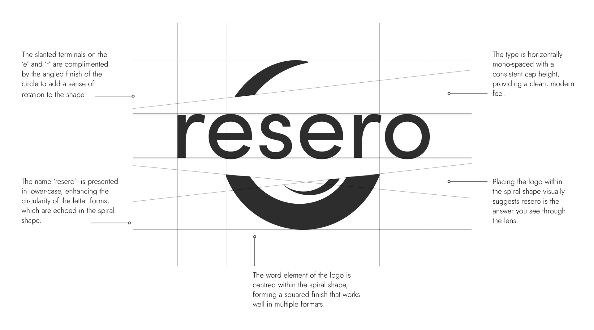
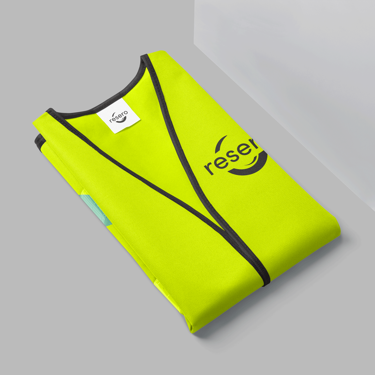
The chosen logo design features the lower-case, Sofia Pro typeface nestled within a dynamic spiral form. This circular mark symbolises both constant movement and change, as well as holistic renewal – referring to Resero’s link with sustainability and innovation.
The design also visually recalls a telescope or camera lens, with the smaller curved flick acting like a reflection on glass. This symbolic link with vision, insight, and knowledge resonates with the etymology of the brand name.
Inspired by the circular form of the logo, we produced a range of graphic elements that could be used as backgrounds, graphic treatments, tie the identity together.


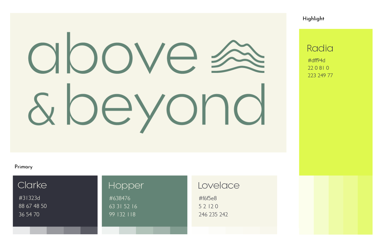
Themes of exploration, journeying and innovation extend throughout the brand identity, from the clean sans serif typeface, to the nomenclature of the colour palette, which pays homage to female computer scientists.
The organic shapes of the contour play off against the simplicity of the wordmark, introducing further visual interest and a reminder of Above & Beyond's focus on sustainability.
”During the rebrand to Resero, Avery and Brown were instrumental, not only providing unwavering support and expertise but also actively involving many Resero team members. By considering everyone's input, they ensured the new identity authentically reflected the whole company. The A&B team took the time to understand us and our clients; really making our innovative nature as a company stand out. Every detail of the brand has been treated with care, from the name and logo to email signature layouts. Through their attention to detail and inclusive approach, they not only revitalised Resero's identity, but perfectly represented our strengths and values."

NEIL DADY
Managing Director, RESERO
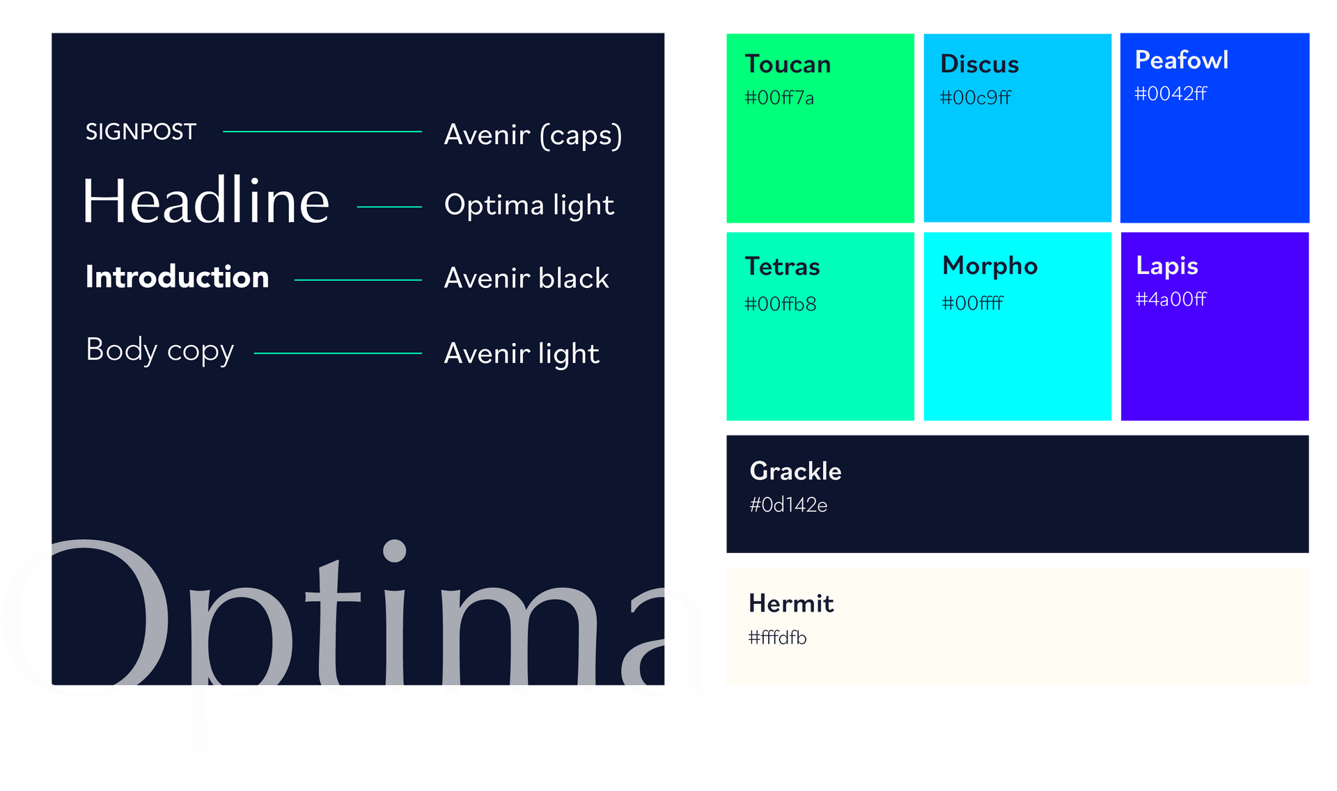
Colour + typography
The primary font for the brand is Avenir, backed by Optima for use in headlines and highlighted text. This combination allows for clean, readable copy, with visual interest introduced by the curved terminals of Avenir and the high contrast of Optima.
For the brand colours, we chose a bold tonal palette of blues and greens. The core brand colours (Grackle/Hermit) provide a clean professionalism, counterbalanced by the pops of vibrancy from the brighter highlights. The colours take their names from phenomena in the natural world – mineral, animal and plant – that reveal the wonder of the Earth’s palette.
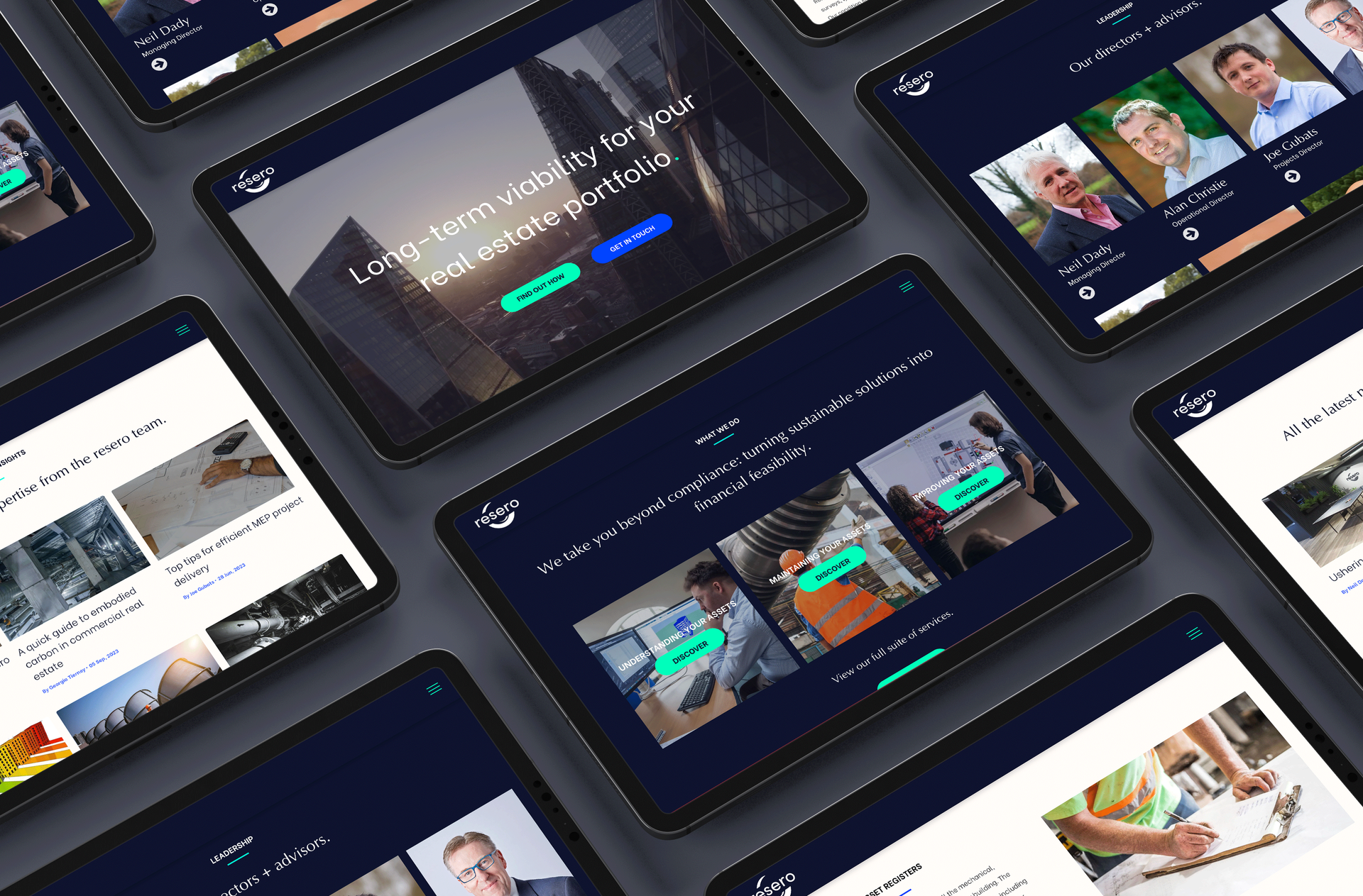
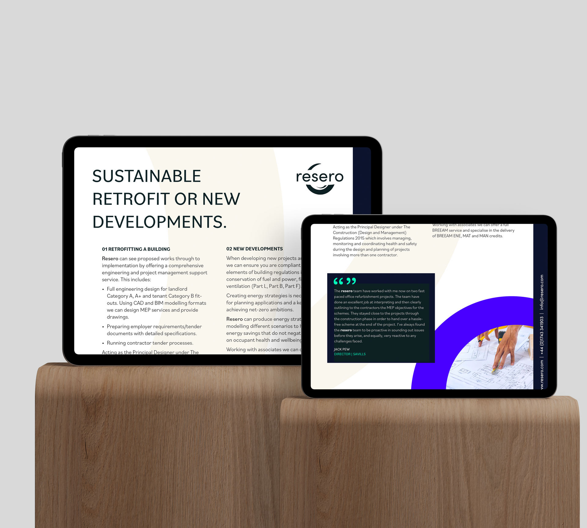
Web design + messaging
The second stage of the project was the development of a new website and the roll out of the key messaging pillars we'd developed in the early stages of the process. We worked with both the in house marketing and operations teams to build out the site structure and copy. We paid particular attention to writing and designing 9 new service pages, built around the core service areas of "Understand", "Maintain" and "Improve". These themes helped to provide clarity and accessibility to somewhat complex and overlapping service areas.
”Working Avery & Brown on the recent rebrand launch has been a pleasure. Their team translated our company's narrative and aspirations into a fresh visual identity. No question was too much, no request received less than thorough consideration. Their collaboration with so many across the company to ensured everyone’s thoughts were considered and they really took the time to understand exactly how Resero operates. Working with such a dynamic agency has been incredibly productive, and I’m looking forward to future collaborative efforts."

Holly Champion
Business development coordinator, RESERO
Trailer production
We felt a company trailer would provide a useful asset in the launch of the brand. A longer-form video would introduce key members of the Resero team, and bring together the core messaging work into a succinct introduction to the company, its purpose and offering.
We produced a storyboard and script in collaboration with the Managing Director, before working with Null.co to shoot and cut the film, which now sits proudly on the homepage of their new site.
Watch a behind the scenes take on the Resero project.
”It was a great experience, really collaborative and we loved working with Beth. Having a clear and consistent brand, encompassing a new logo, colours, visuals, and clear concise messaging was key for Above & Beyond going forward. Beth helped us pull all of this together into a really neat brand pack which we helped guide all our marketing and communications."

CHERRY SWAYNE, CEO
ABOVE & BEYOND
VERIFY US
2020-2022 Impact Report
2023-2024 Impact Report - Dropping soon!
The newsletter from Avery & Brown that delights, amazes and surprises!


© 2020-2024 All rights reserved | Avery & Brown Ltd | Company Number 12805949 | Privacy Policy | Cookie Policy