90% of our clients start their journey with us with our Brand & Marketing Audit.
Above & Beyond
Messaging refinement and visual rebrand for a independent recruiter who work in the climate tech sector.
Above & Beyond
Messaging refinement and visual rebrand for a independent recruiter who work in the climate tech sector.
The background
Above & Beyond is a recruitment consultancy who work with innovative technology start-ups in the sustainability space. They specialise in partnership-based recruitment, working as an extension of their clients to find them the senior developers and CTOs they need to boost their growth and positive impact. Having had a successful first few years, the company was looking to develop their visual brand and clarify their messaging.
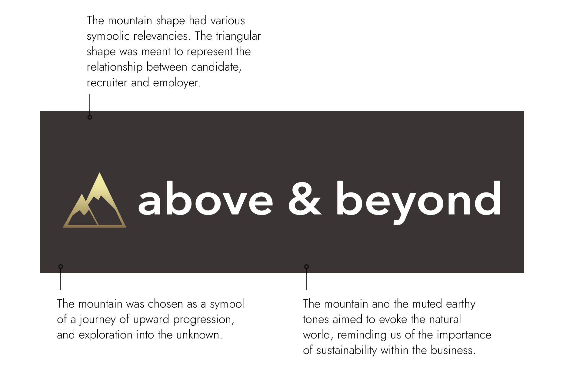
The original brand
The background
Above & Beyond is a recruitment consultancy who work with innovative technology start-ups in the sustainability space. They specialise in partnership-based recruitment, working as an extension of their clients to find them the senior developers and CTOs they need to boost their growth and positive impact. Having had a successful first few years, the company was looking to develop their visual brand and clarify their messaging.
The original brand
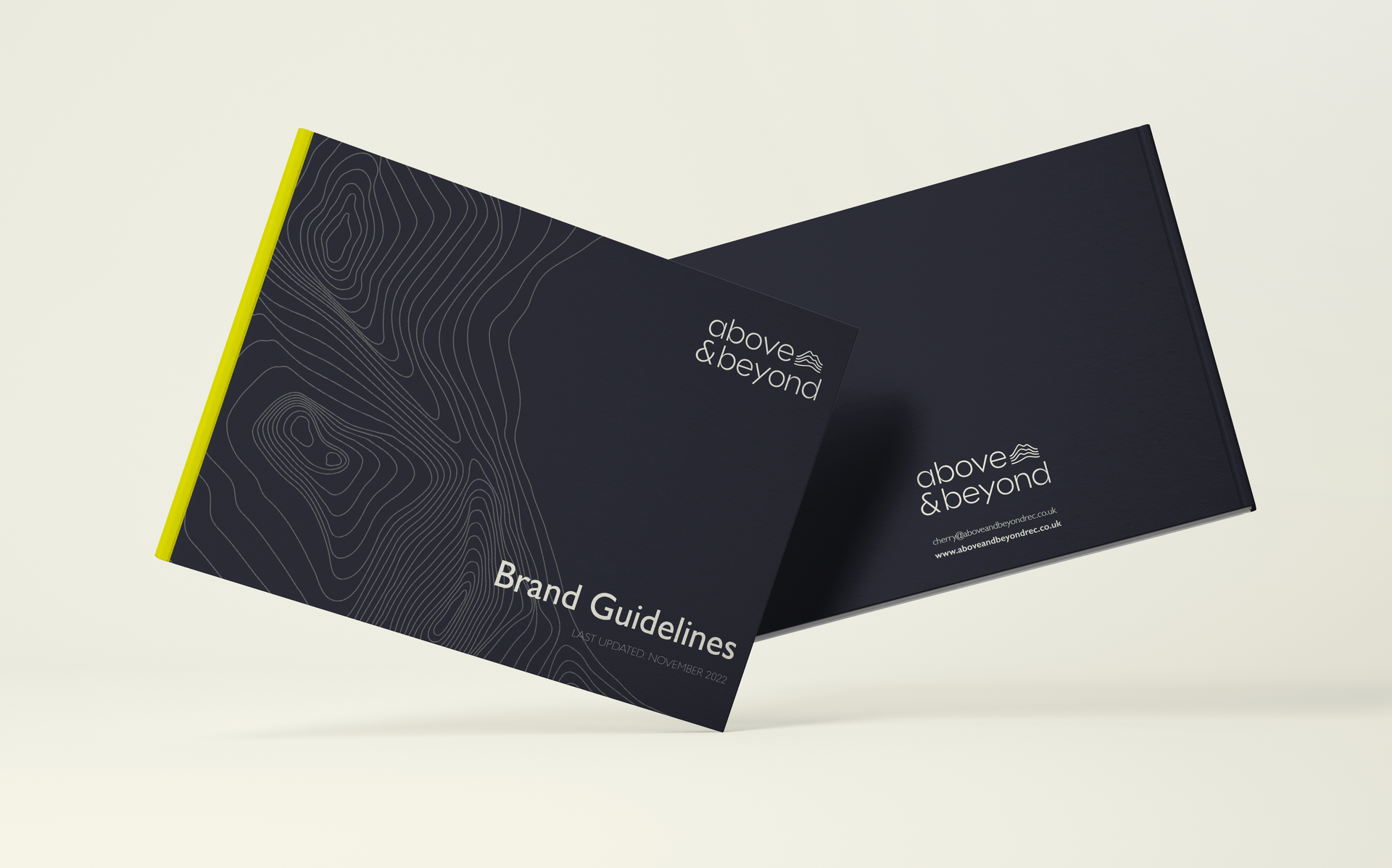
Brand story and purpose | Messaging | Design identity |
Copywriting support | Brand playbook
Brand story and purpose | Messaging | Design identity |
Copywriting support | Brand playbook
The brief
Cherry was keen to retain the original strategic meaning held in the previous design style, but to develop something that appealed to a highly innovative sector and that felt professional but not too corporate.
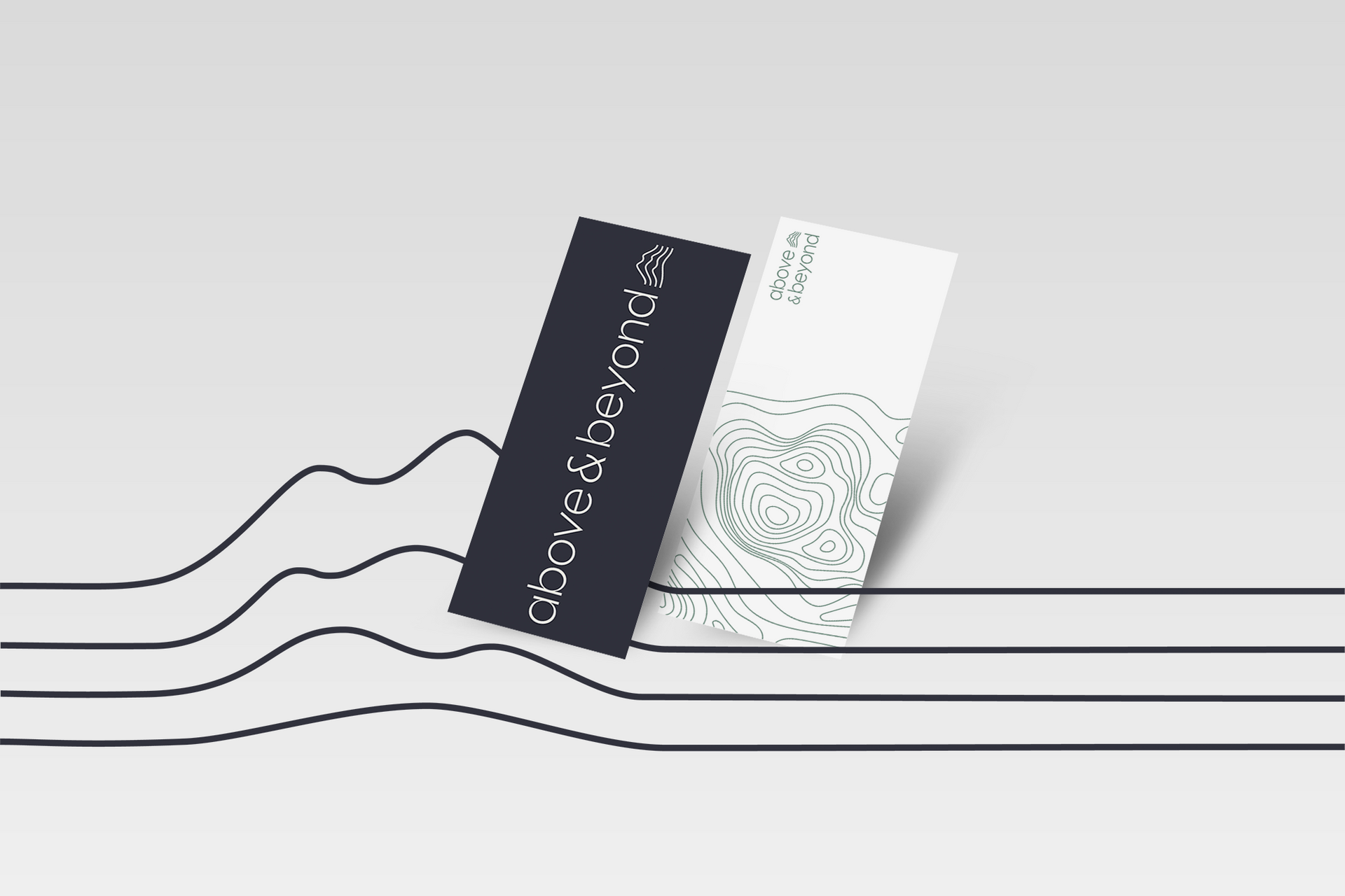
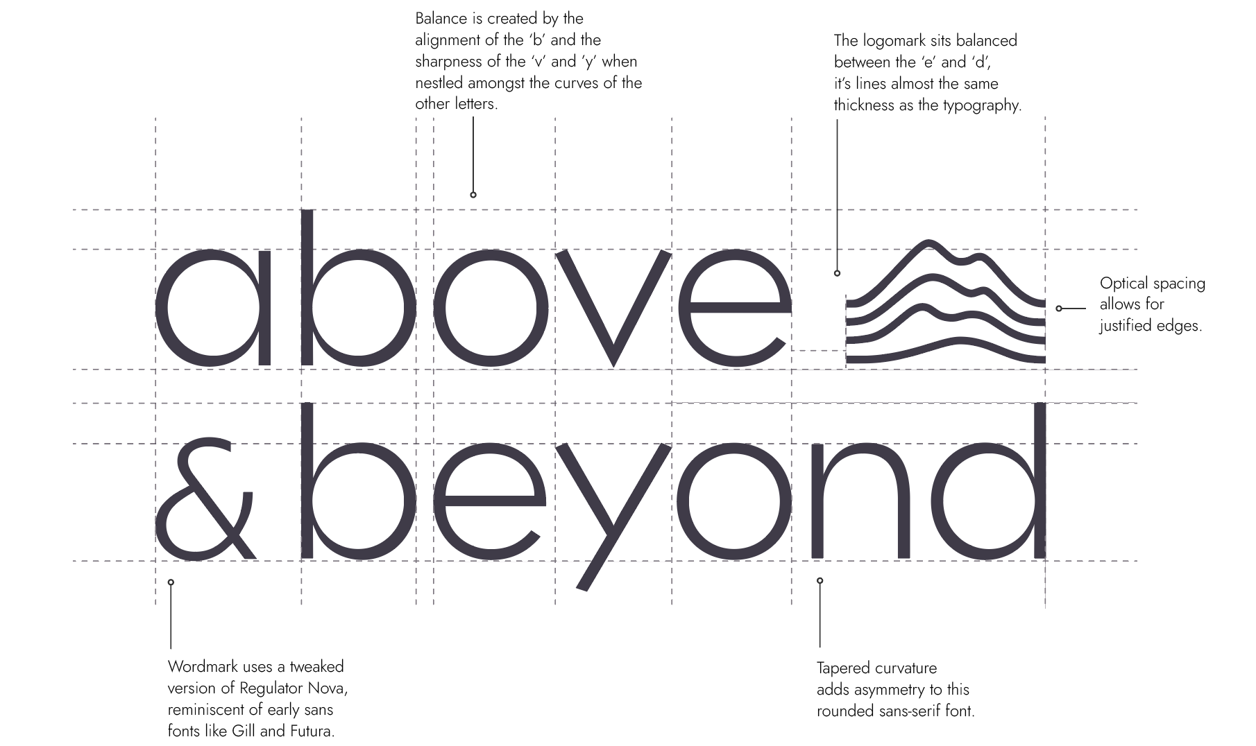
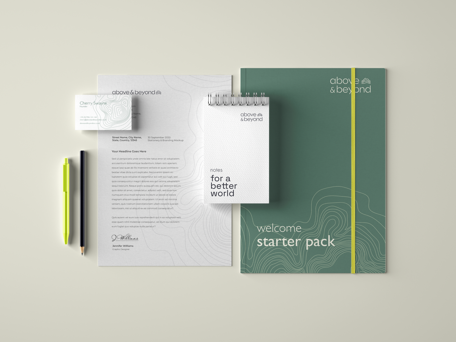
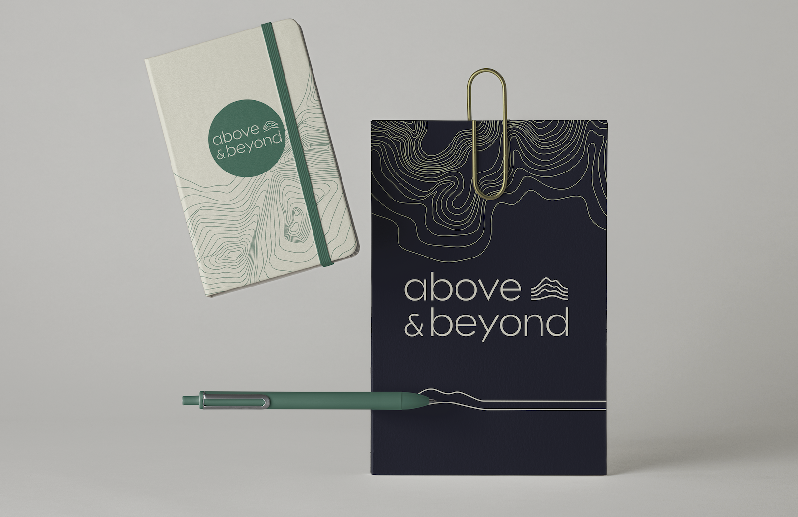
The chosen route did just that, inspired by visual resources like cartography and geological illustration, it shifts the literal symbol of a mountain to a more abstract interpretation. The contour motif appears in a restrained form within the logo, and with more complex counterparts in the graphic elements used on image treatment and backgrounds.
The brief
Cherry was keen to retain the original strategic meaning held in the previous design style, but to develop something that appealed to a highly innovative sector and that felt professional but not too corporate.
The chosen route did just that, inspired by visual resources like cartography and geological illustration, it shifts the literal symbol of a mountain to a more abstract interpretation. The contour motif appears in a restrained form within the logo, and with more complex counterparts in the graphic elements used on image treatment and backgrounds.
Themes of exploration, journeying and innovation extend throughout the brand identity, from the clean sans serif typeface, to the nomenclature of the colour palette, which pays homage to female computer scientists.
The organic shapes of the contour play off against the simplicity of the wordmark, introducing further visual interest and a reminder of Above & Beyond's focus on sustainability.
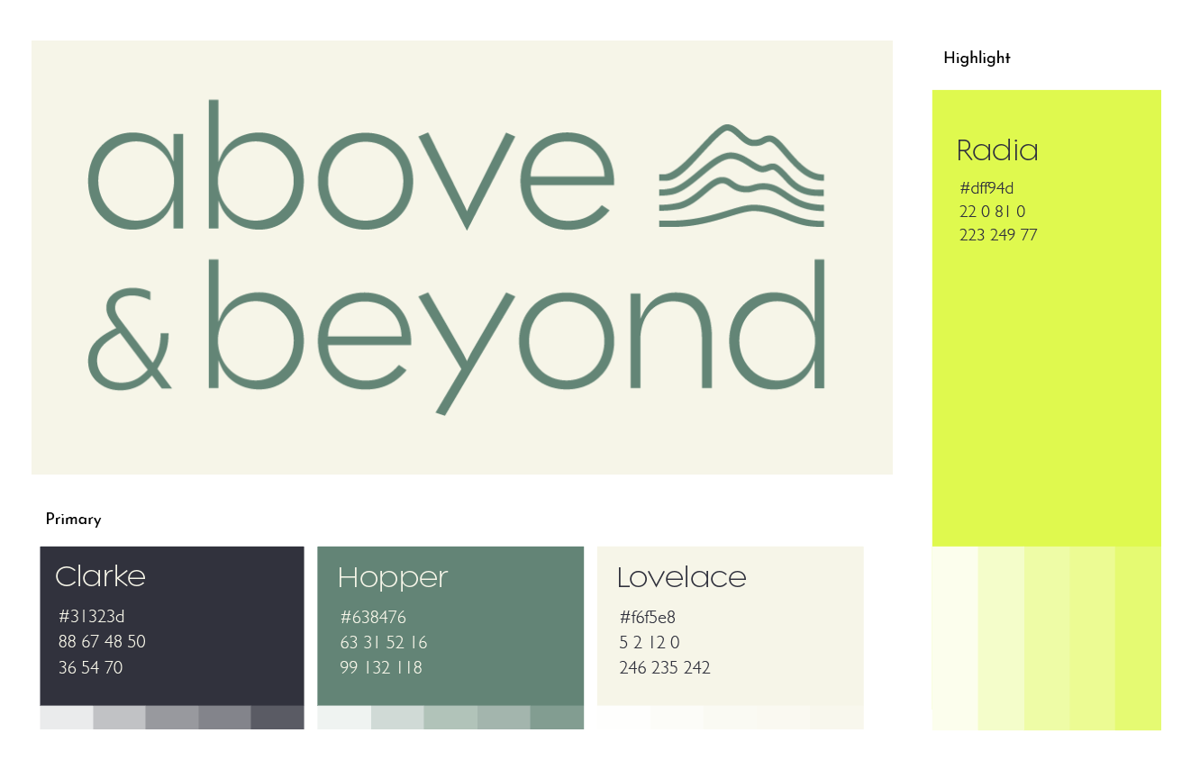
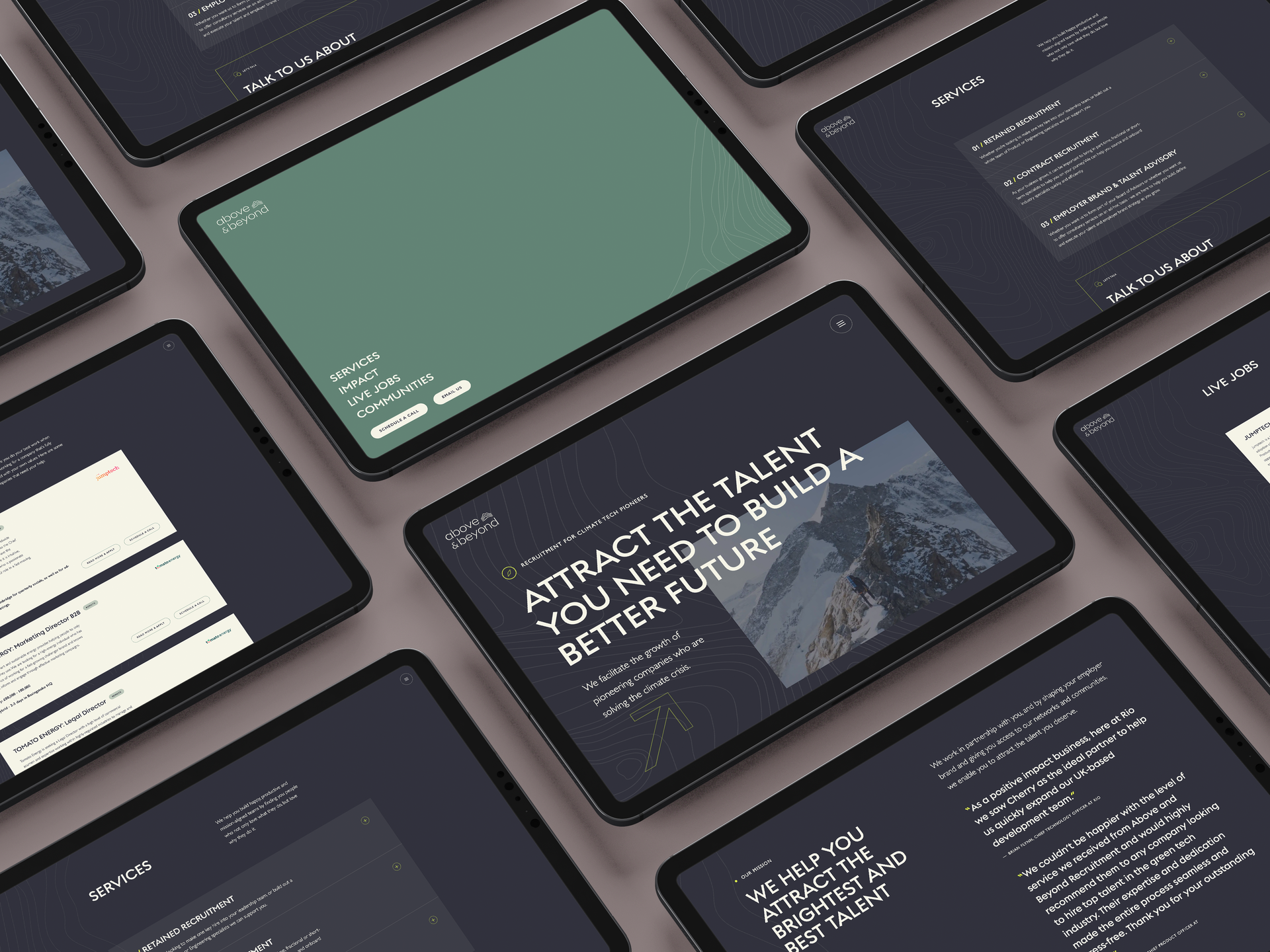
Web design by Future Selves. Development by Tempest.
”It was a great experience, really collaborative and we loved working with Beth. Having a clear and consistent brand, encompassing a new logo, colours, visuals, and clear concise messaging was key for Above & Beyond going forward. Beth helped us pull all of this together into a really neat brand pack which we helped guide all our marketing and communications."

CHERRY SWAYNE, CEO
ABOVE & BEYOND
”It was a great experience, really collaborative and we loved working with Beth. Having a clear and consistent brand, encompassing a new logo, colours, visuals, and clear concise messaging was key for Above & Beyond going forward. Beth helped us pull all of this together into a really neat brand pack which we helped guide all our marketing and communications."
CHERRY SWAYNE, CEO
ABOVE & BEYOND
MEET US
Want to
meet the team?
Find out what makes us tick.


© 2020-2024 All rights reserved | Avery & Brown Ltd | Company Number 12805949 | Privacy Policy | Cookie Policy